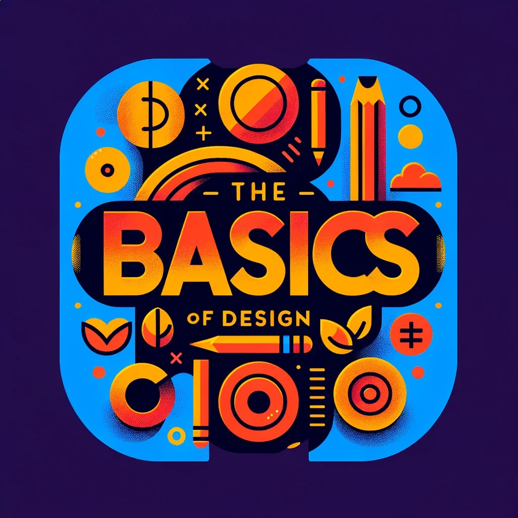
The Basics of Design: Understanding Visual Principles – Covering core design principles such as balance, contrast, and hierarchy.
Between Day 1 and Day 2 I think I certainly bit off more than I can chew. 🙂 So much information on this subject and very little time to consume it. I decided to take a very high level approach at the moment. With the understanding I will have to really dive in over time and continue to refine and understand these concepts in my work. I also plan on breaking a bunch of these rules.

The vast expanse of graphic design principles looms large, packed with its own language and logic. It’s akin to learning how to read all over again, but this time, the alphabet consists of lines, shapes, and colors. Today, I’m sharing my initial foray into three fundamental principles of design: balance, contrast, and hierarchy. These aren’t just abstract concepts tucked away in design textbooks; they’re the very essence of how we organize and interpret the visual stimuli around us.
Balance: The Art of Equilibrium
Balance, in its most basic form, is about ensuring elements are distributed evenly to create a sense of stability. In graphic design, this could mean aligning text and images in a way that neither side of the page feels heavier than the other. But here’s the kicker: I’ve seen this principle in action when rearranging my living room. The quest for equilibrium in a space – where a couch, coffee table, and bookshelf coexist harmoniously – mirrors the balancing act on a blank canvas or screen. It’s about symmetry, or sometimes asymmetry, that feels just right, echoing the balance we unconsciously seek in our lives.
Contrast: The Highlight Reel
Is the use of opposing elements to draw attention or create visual interest. In the world of design, contrast can be achieved through colors, fonts, or sizes, like a bold, black headline against a white background. Outside design, contrast is at play in our wardrobes. Pairing a bright scarf with a dark coat catches the eye, much like a contrasting call-to-action button on a website.
Hierarchy: Organizing Chaos
Then there’s hierarchy, a principle that’s all about organizing elements to show their order of importance. It’s what makes a website navigable or an infographic digestible. But beyond the screen, hierarchy is in the grocery list organized by aisles, the prioritized to-do list on my desk, even in the way we listen to a piece of music, with the melody often taking precedence over the harmony. This lens of hierarchy has made me more analytical about how I will structure information, both visually and functionally, to communicate more effectively.
From Theory to Practice
My journey into the world of design is teaching me to see. I mean, really see. I’m noticing the layout of menus, the signage guiding me through airports, ( My Daughter and Granddaughter flew home today and I took advantage of paying attention to the details in the airport) and even the packaging of my favorite beverage in a new light. These principles aren’t just about making things look good; they’re about making them work better, communicate clearer, and tell stories more compellingly.
Wrapping Up: The Road Ahead
As I wrap my head around these principles, I can’t help but feel excited about applying them more consciously in my projects. My next steps? Diving into the realms of color theory and typography. If balance, contrast, and hierarchy are about arranging elements, color and type are about choosing the right ones. The journey of a visual creator is filled with learning, and I’m here for all of it. No blog entries for the next couple of days as I will be putting my efforts into color theory and Topography. I also plan to work on re-doing my logo for “SemperPops” brand and some social media updates. Thanks for following along and looking forward to interacting with everyone.
