Exploring Branding Basics – What Makes a Brand Stand Out?
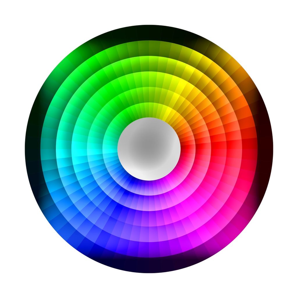
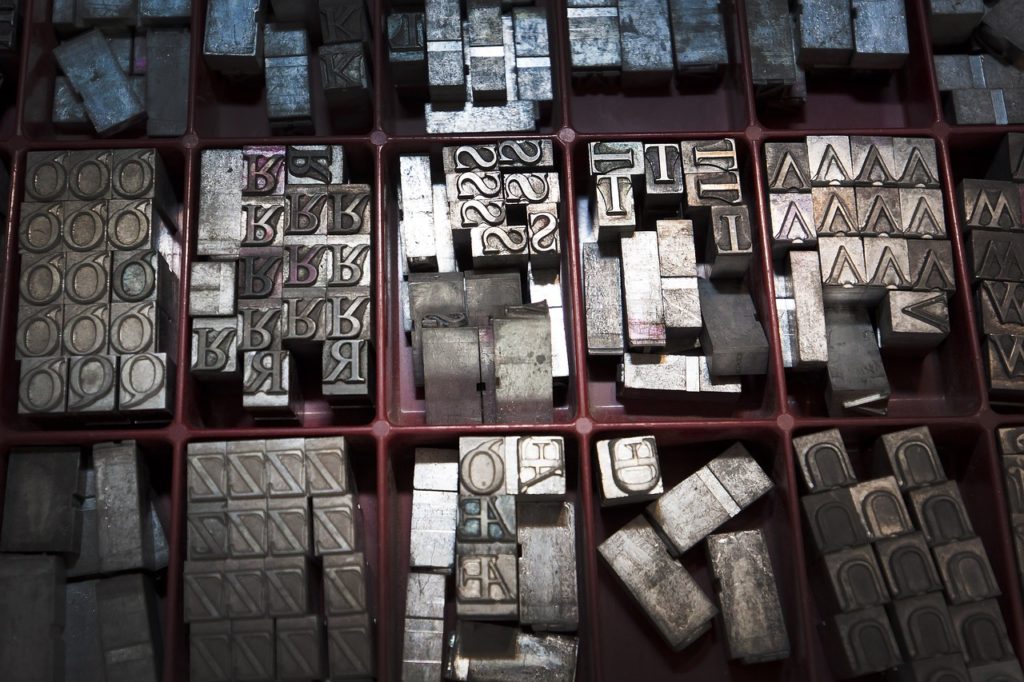
Over the past couple of days, my journey into the world of visual creation has taken me through the vibrant landscapes of color theory and the structured alleyways of typography basics. Color theory, with its emotional palette, taught me how colors can evoke feelings, convey messages, and create an atmosphere. Typography, on the other hand, revealed the power of text not just as a medium of communication but as a visual tool that can add personality, tone, and clarity to the message being conveyed. Both elements are crucial in the crafting of a brand’s identity, acting as the foundational stones upon which a brand can build its unique presence in a crowded marketplace.
The Essence of Branding

Branding is not just about a logo or a catchy tagline; it’s about creating a cohesive identity that resonates with your target audience, differentiates you from competitors, and embodies your company’s values and vision. It’s the art of storytelling where every color, shape, and font choice adds a chapter to your brand’s narrative.
Applying Color Theory and Typography to Branding
To understand how color theory and typography play into branding, let’s consider a fictional company, “Ripple Retreats,” that specializes in high-quality tents catered specifically to the fly fishing community.
Ripple Retreats: A Case Study
Color Palette: The company opts for a color scheme that reflects the natural environment where their products are most often used. A deep green represents the verdant banks of a river, a soft blue for the clear, running water, and a muted brown that echoes the earthy tones of the wilderness. This choice not only appeals aesthetically to their target audience but also evokes feelings of calm, serenity, and connection to nature, reinforcing the brand’s promise of offering a peaceful fishing experience.
Typography: Ripple Retreats chooses a typeface that mirrors the fluidity and elegance of a river’s flow, with soft, rounded letters that suggest approachability and comfort. Yet, for their tagline, “Where the River Calls,” they select a more distinct script font that conveys a sense of adventure and personal invitation. This combination of typefaces helps to establish a brand identity that is both welcoming and inspiring, appealing directly to the hearts of fly fishing enthusiasts.
Making a Brand Stand Out
Ripple Retreats stands out by integrating its core identity into every aspect of its branding. The logo, a stylized fish forming a subtle “R” within a tent silhouette, encapsulates the brand’s essence in a single, memorable image. Their marketing materials, from brochures to online ads, consistently use their chosen color palette and typefaces, creating a strong visual consistency that increases brand recognition.
Moreover, Ripple Retreats tells a story through its branding. Their website features immersive imagery of serene fishing locales, with tents pitched in idyllic settings, accompanied by narratives from satisfied customers who’ve found solace and adventure with Ripple Retreats’ products. This storytelling approach not only showcases their tents but also sells the experience, the lifestyle that the brand embodies.
Conclusion
The journey of Ripple Retreats from a mere concept to a standout brand in the fly fishing market illustrates the transformative power of thoughtful branding. By applying the principles of color theory and typography, any brand can carve out its niche, connect with its audience on an emotional level, and build a lasting identity.
As I advance on my own path of visual creation, the next two days are set to embark on a practical application of the principles I’ve learned so far. I’ll be diving into the design phase, creating a logo and developing social media branding elements for Ripple Retreats. This step will challenge me to synthesize my understanding of color, typography, and branding into a visual identity that encapsulates the essence of Ripple Retreats. It’s an exciting opportunity to bring together theory and practice, aiming to craft a logo that’s not just visually appealing but tells the brand’s story at a glance. Following the logo design, the focus will shift to social media branding, where I’ll apply the brand’s visual language across various platforms to ensure a consistent and engaging online presence.
This hands-on experience is crucial, as it will not only test my skills and creativity but also deepen my understanding of branding’s nuances. By designing for Ripple Retreats, I aim to create a cohesive, memorable brand experience that stands out in the digital landscape. Stay tuned as I share my progress and insights from this practical application of branding principles in the coming days.